Blue does not build trust and orange does not create urgency. What actually moves the number is whether the eye knows where to go.
 Marku Leone · Founder, donebyverde · South Florida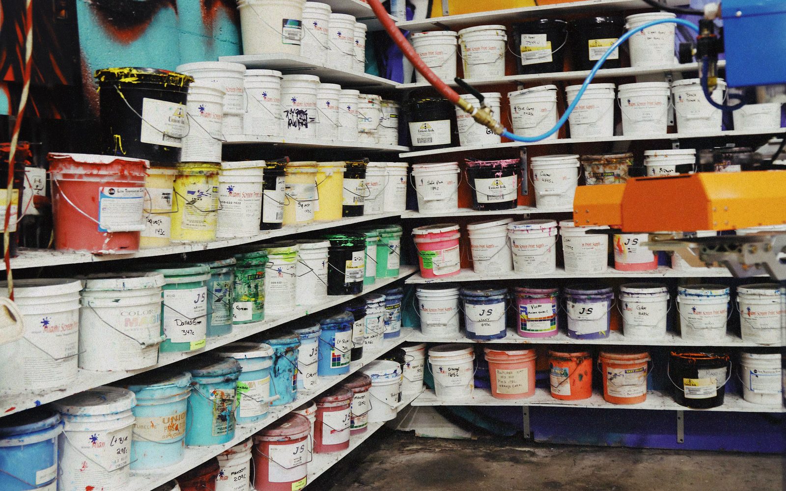
The ink wall at Mint Prints. Every one of these is a brand decision.
Somewhere in every branding deck there is a slide explaining that blue conveys trust, green conveys growth and red conveys urgency. It is a comfortable story and there is very little behind it. The associations are cultural, they vary by market, they reverse by context, and the studies people cite for them tend to be small, old, or measuring something else entirely.
What does hold up is duller and far more useful. People act on the thing they can see, understand and find. Colour affects conversion mainly through contrast, hierarchy and consistency, and those three are engineering problems with correct answers, not taste problems with opinions.
The single most effective palette decision is to pick one accent colour and refuse to use it for anything except the thing you want clicked. Not for headings. Not for decorative underlines. Not for the icon set. One colour, one job.
This works because contrast is relative. An accent that appears fourteen times on a page has no pull, because nothing stands out when everything stands out. The same colour used once, on the only button that matters, is unmissable. Most sites lose here not by choosing a bad colour but by spending a good one.
The old 60/30/10 rule is a reasonable place to start: roughly sixty percent dominant, thirty percent secondary, ten percent accent. Treat it as a budget rather than a law. What matters is that the accent stays scarce.
The WCAG thresholds are 4.5:1 for normal body text against its background, and 3:1 for large text and for the visual boundaries of interface components. Those numbers exist for accessibility, and treating them as a legal minimum is the wrong frame. They are the point at which text stops costing the reader effort.
Every one of your visitors is reading on a phone, outdoors, at half brightness, with a cracked screen, in a hurry. Grey text on a slightly different grey passes a designer's monitor and fails the parking lot. Run the contrast check on every text and background pair you ship, including the button label against the button fill, which is the pair people forget and the single most important one on the page.
A particularly common failure: a brand colour chosen for a logo, then used as a button fill with white text, at a contrast ratio around 2:1. It looks on brand and it is genuinely hard to read. The fix is not to abandon the brand colour, it is to darken the button variant while leaving the logo alone. Brand colours and interface colours do not have to be the same colour.
Start with the surface. Pick a background and a text colour that pass contrast comfortably, and get the body of the page readable before you introduce a single brand colour. Most palettes fail because they are designed as a row of swatches rather than as a page.
Then add the accent, and place it only on the primary action. Then add exactly one supporting tone for secondary interface work, borders, muted text, card surfaces. Then stop. If the palette needs a fifth and sixth colour to feel finished, the layout is usually doing the wrong job and colour is being asked to rescue it.
Check the whole thing in both light and dark, because a colour with enough contrast on white frequently has none on near black, and the reverse. If you support a dark interface, the accent almost always needs a second, brighter variant. That is not two brand colours. It is one brand colour with two correct renderings.
Palettes are approved as neat rows of rectangles and then deployed onto pages full of photography, video, gradients and user content. The rectangle tells you nothing about what happens when the accent button sits on a busy hero image.
Before anything is final, put the real palette on the real page with the real photography, then look at it on a phone, at arm's length, outdoors if you can. Ask one question: within one second, where does the eye go? If the answer is not the primary action, the palette has failed regardless of how good the swatches looked.
There is an entire industry of case studies about a button colour change lifting conversion by some improbable percentage. Almost all of them are single tests on single pages with sample sizes too small to mean anything, and they are usually measuring the accent scarcity effect described above rather than the colour itself.
The bigger and more reliable win is consistency. When every primary action across your site, your emails and your ads is the same colour, you are teaching a pattern. Repeat visitors stop reading buttons and start recognising them. That effect compounds quietly over months and never shows up in a two week test.
Does body text clear 4.5:1 against its background. Does the button label clear 4.5:1 against the button fill. Does exactly one colour mean "click this" and appear nowhere else. Does the palette survive a phone screen at half brightness. Does it work in both light and dark. Does every primary action across every channel use the same colour.
Six questions, all answerable in an afternoon, all more consequential than whether blue conveys trust.
Founder of donebyverde, a studio in South Florida. We build the site, shoot the content, and wire the follow up that answers first, for service businesses across South Florida. This article is how we actually work.
Talk it throughReal partnerships start with one strategy call.
Get It Done